QC Exclusive
Redesign
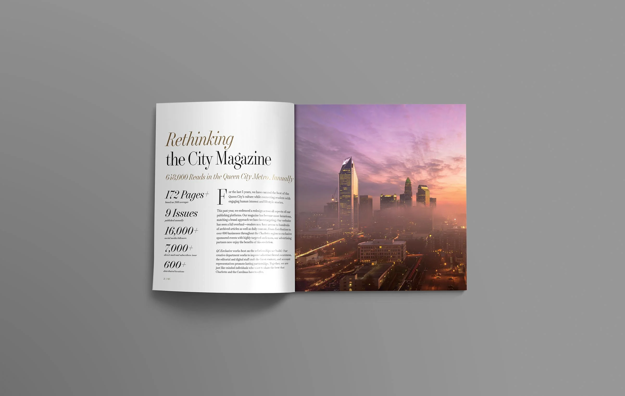
Building a new readership.
When QC Exclusive Magazine launched in 2011, the editors had one goal in mind—to make a magazine that paid the bills. By 2015, they had reached those goals with flying colors, but they faced a new problem: how does a free magazine stand out among its paid competition?
Magazine design for regional and city magazines is often tired and derivative. QCE wanted to take a national approach. Bye bye to the quickly designed Trajan nameplate. We introduced a new custom nameplate and section titles that represented the attitude of the magazine. We narrowed down free or cheap fonts and replaced them with rich new type families that reflected the tastes of the readership. Instead of following the trends, QC became the one to follow.
ART DIRECTION: Stephen Philpott and JP Grice
Rethinking the type for the magazine seems like a fairly simple task. In 2014, the number of different fonts used was staggering. For the 2016 relaunch, we narrowed it down to two typefaces, Surveyor and Gotham. The two families allowed for an incredible amount of depth.
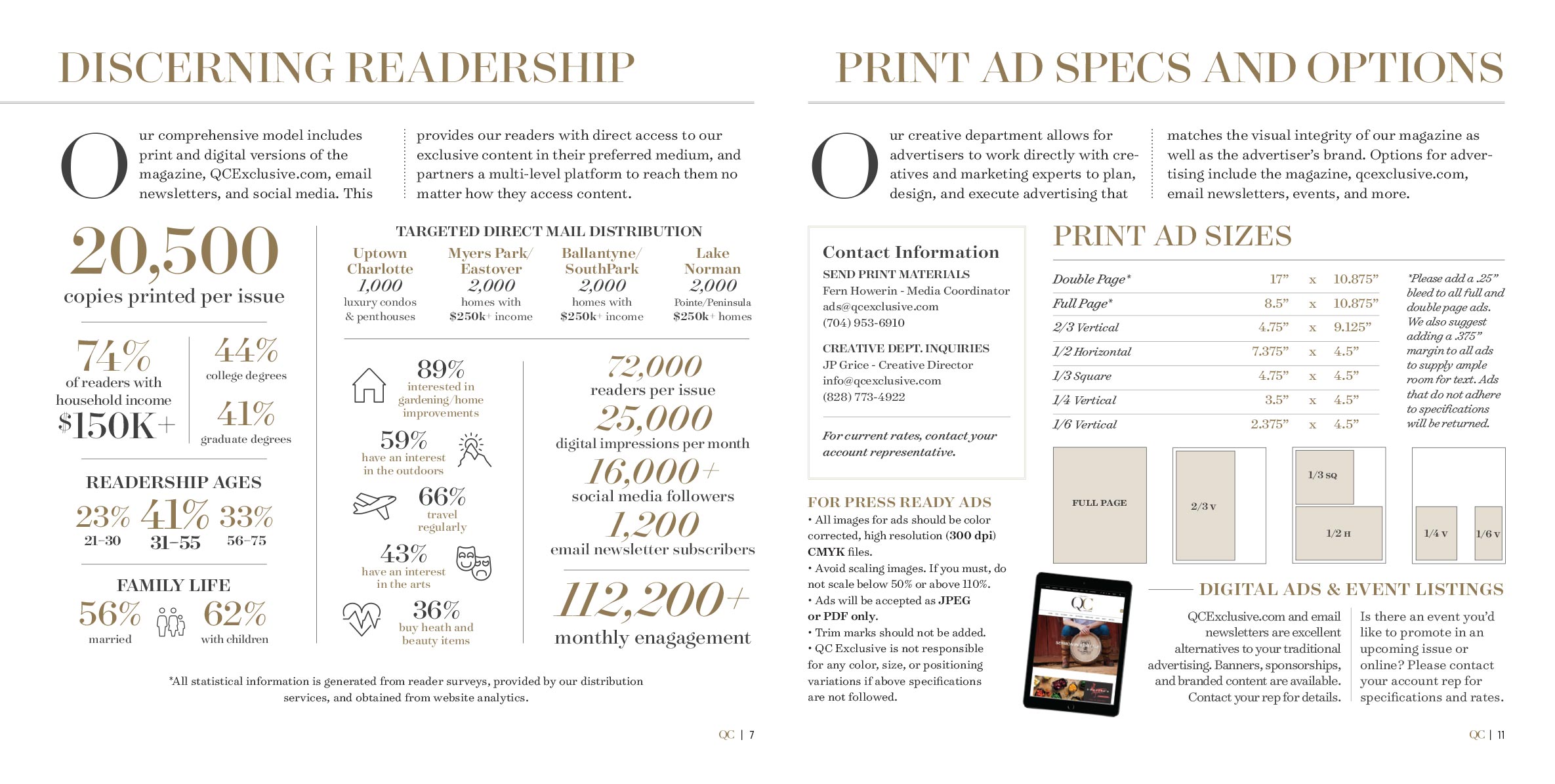
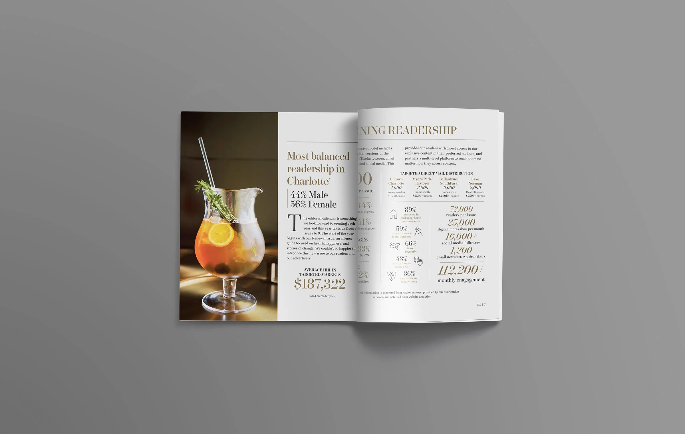
Even magazines need magazines
Despite a successful and major relaunch in 2016, the media kit didn’t receive the same level of attention as the magazine did. For 2017, we chose to rectify that with a kick-ass, clean design focused on strong numbers and engaging content.